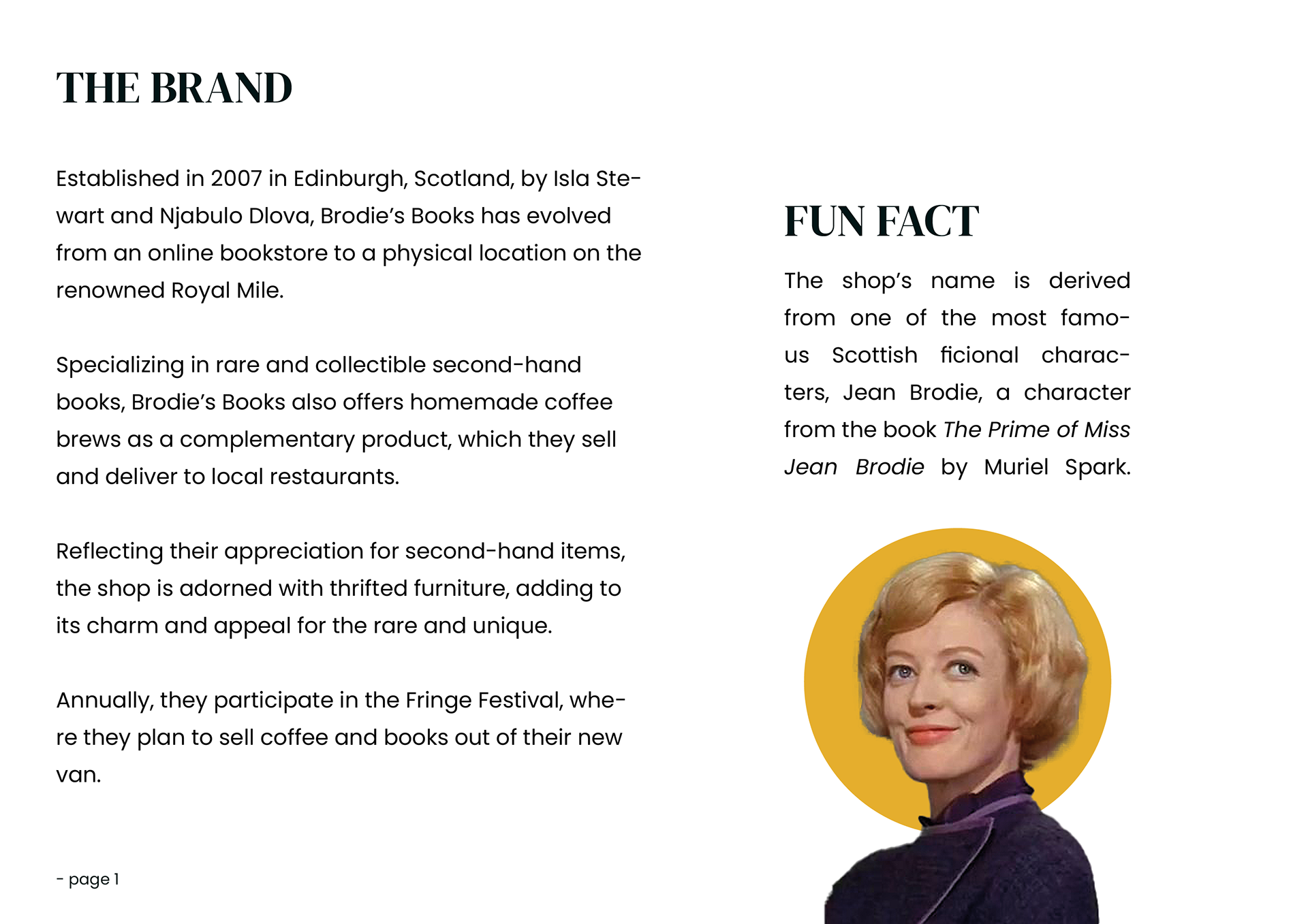
For this assignment, we were tasked with assisting the fictional client Brodie’s Books in their rebranding journey. Brodie's Books is a business that specializes in rare, collectible second-hand books, having previously conducted most of their business through eBay and shipping globally. Their physical presence was limited to a booth at the annual Edinburgh Fringe Festival, where they promoted their books and sold their newest passion project: their custom coffee brew, which they are eager to expand further.
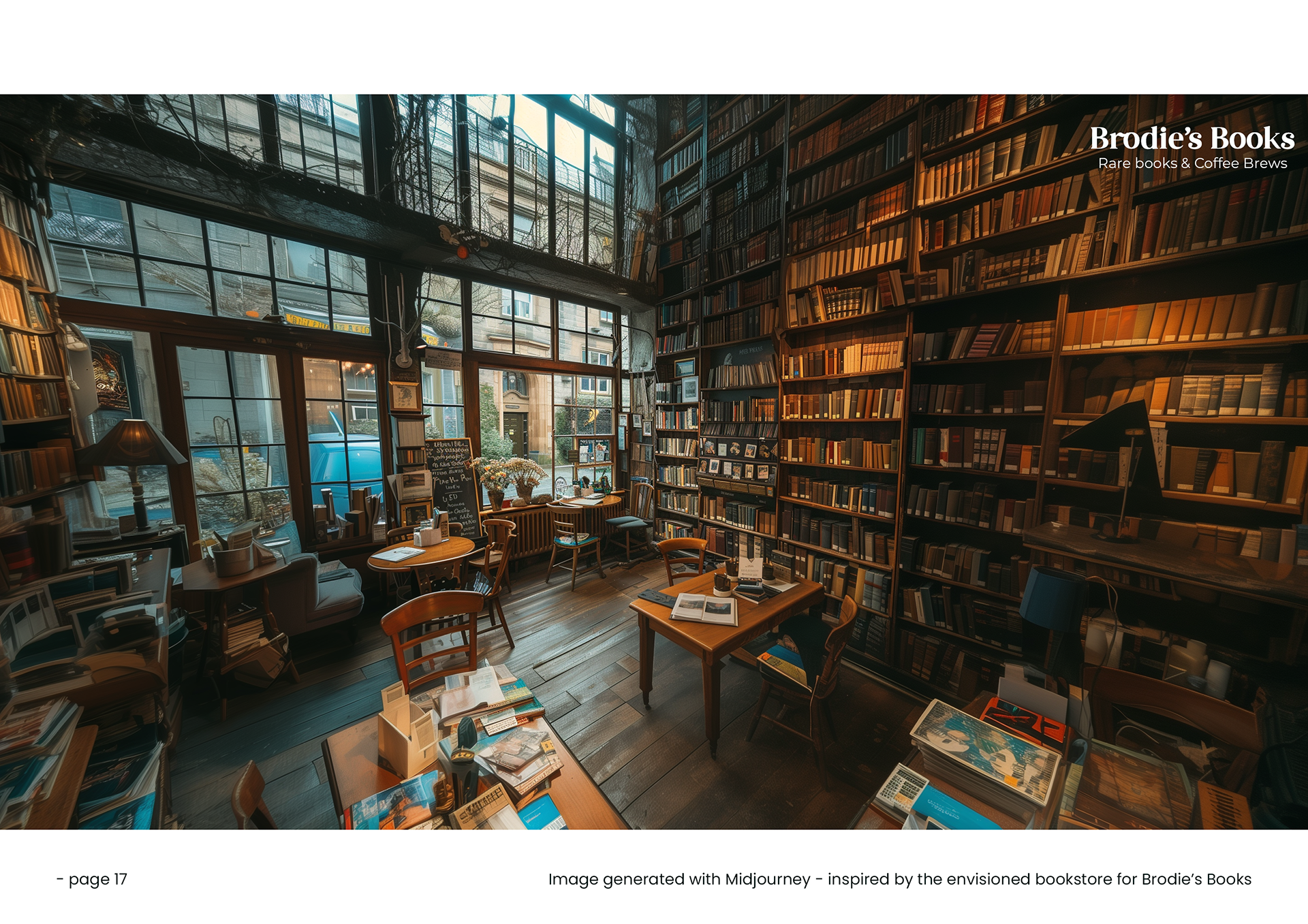
As their business has grown, Brodie's Books recently purchased an old bar in the city center, with plans to transform it into a bookshop and coffee bar hybrid. They envision the shop as not just a space to buy rare books and coffee but as a community hub for book lovers and coffee enthusiasts alike. Their goal is to create a warm, inviting space where customers can relax, discuss books, and exchange ideas over a cup of their custom brew. Staying true to their identity, the shop will be furnished with unique, eclectic items sourced from thrift stores, giving it a charming and authentic atmosphere.
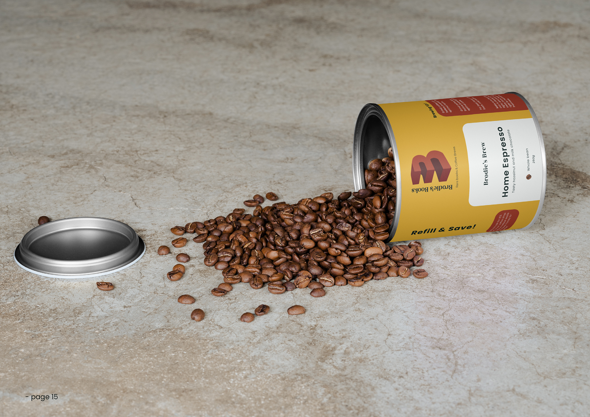
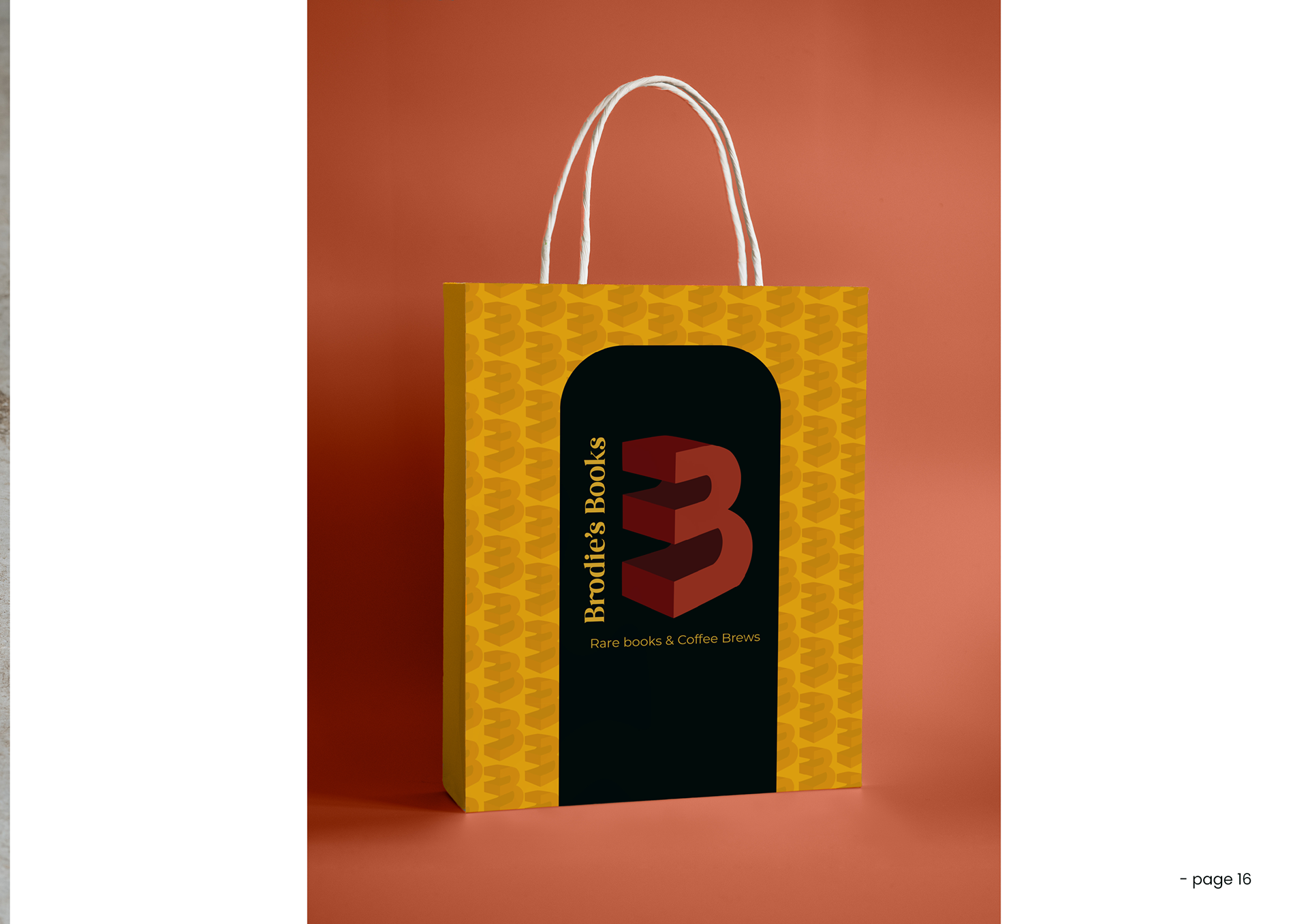
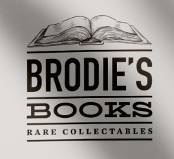
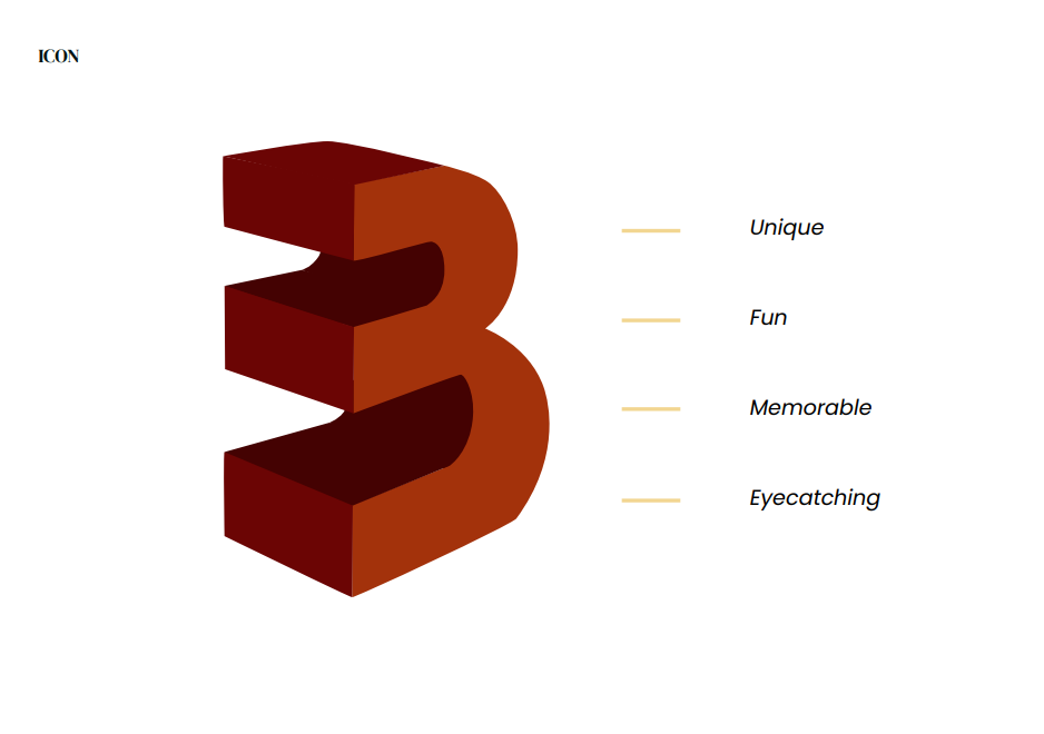
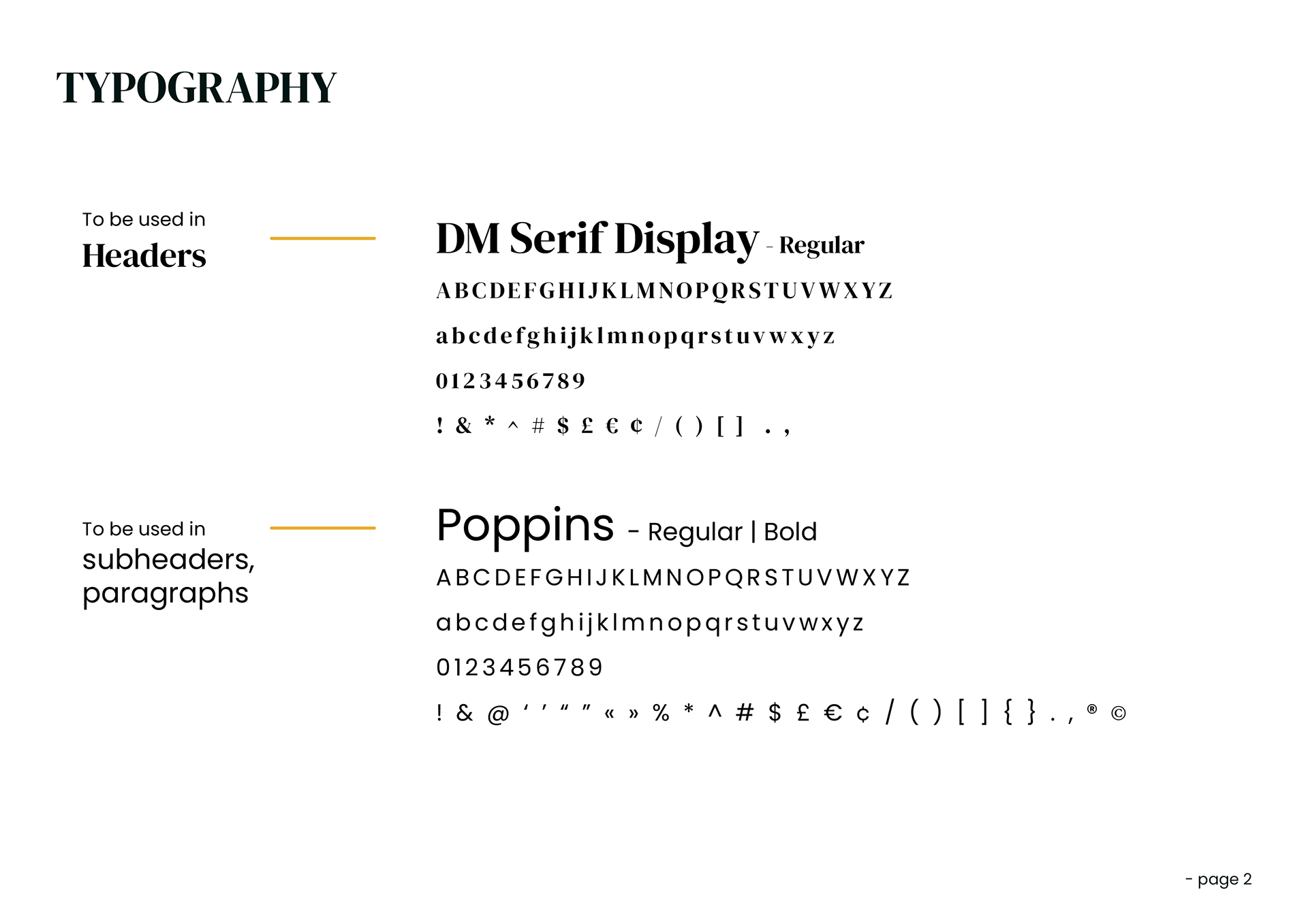
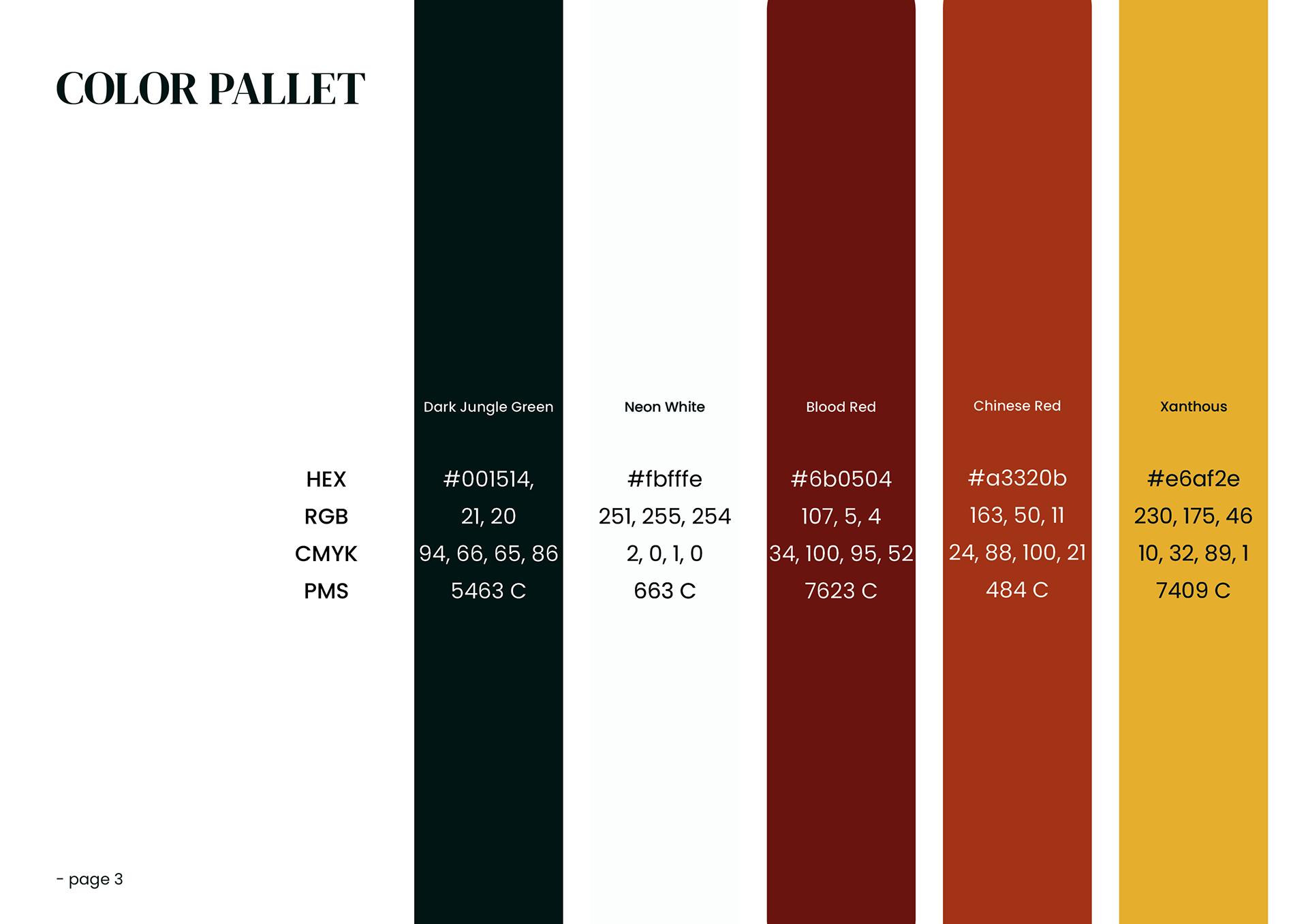
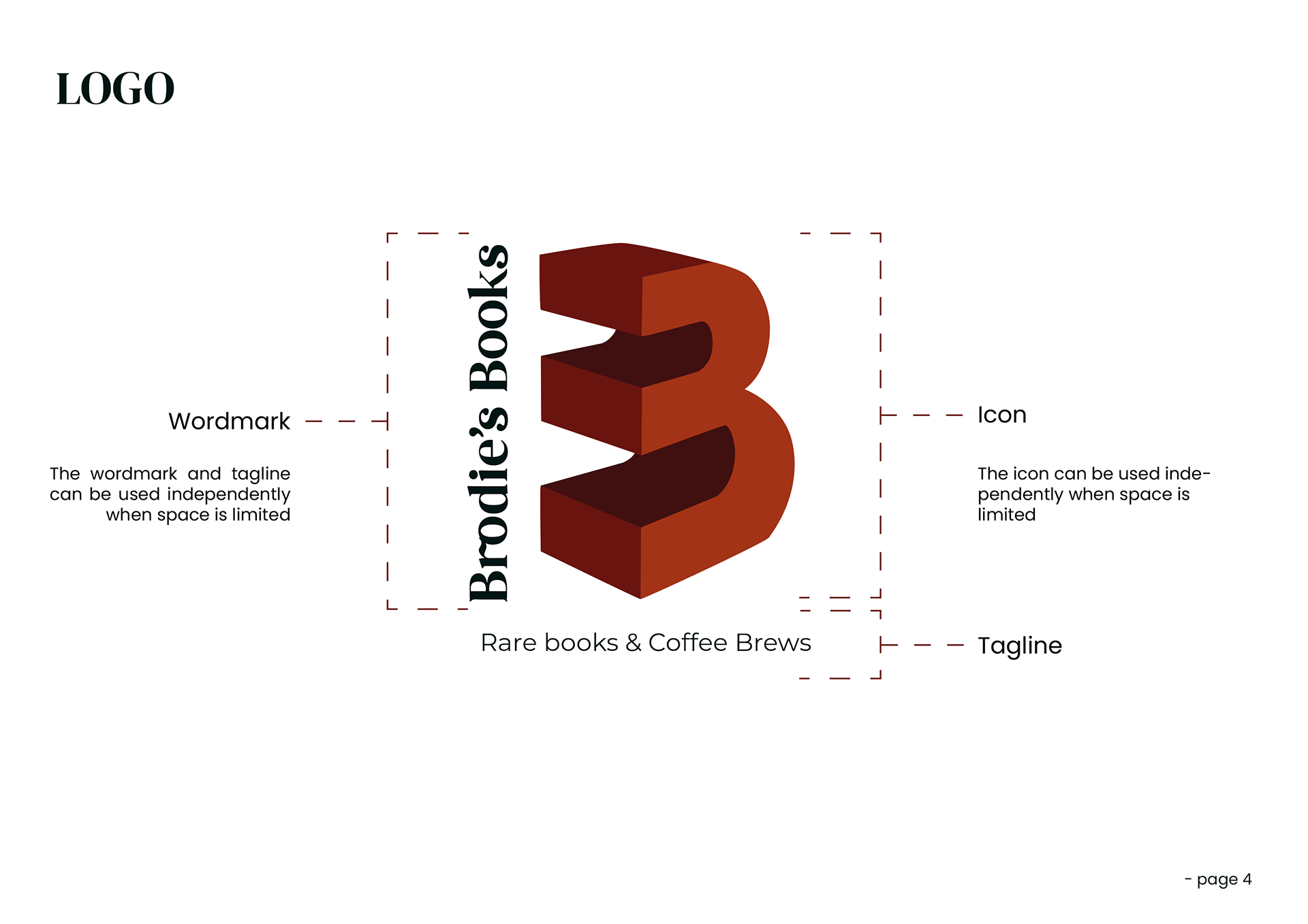
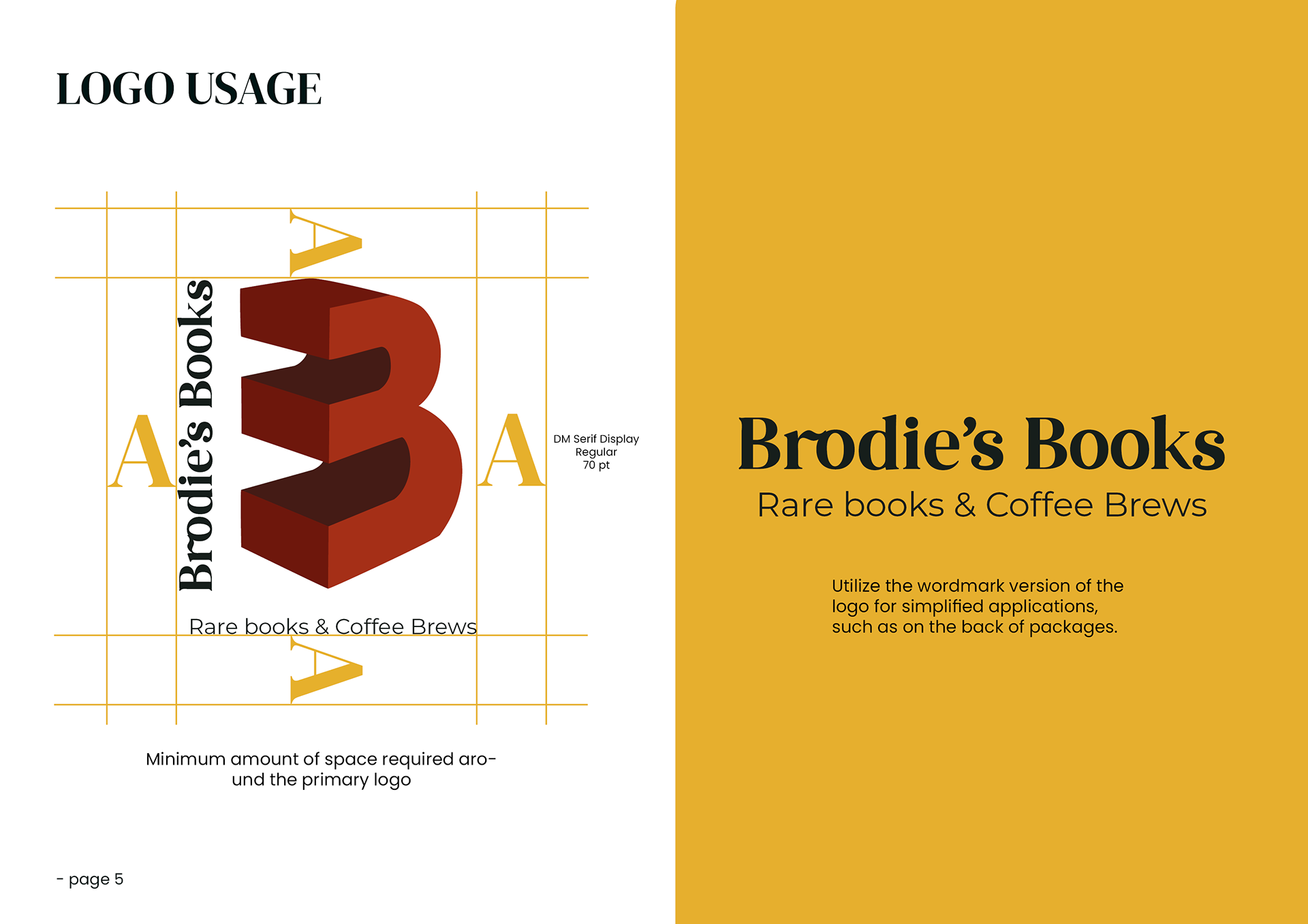
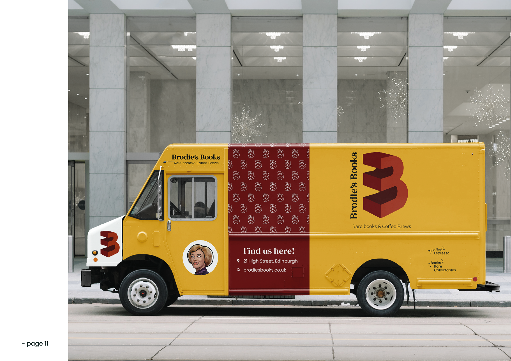
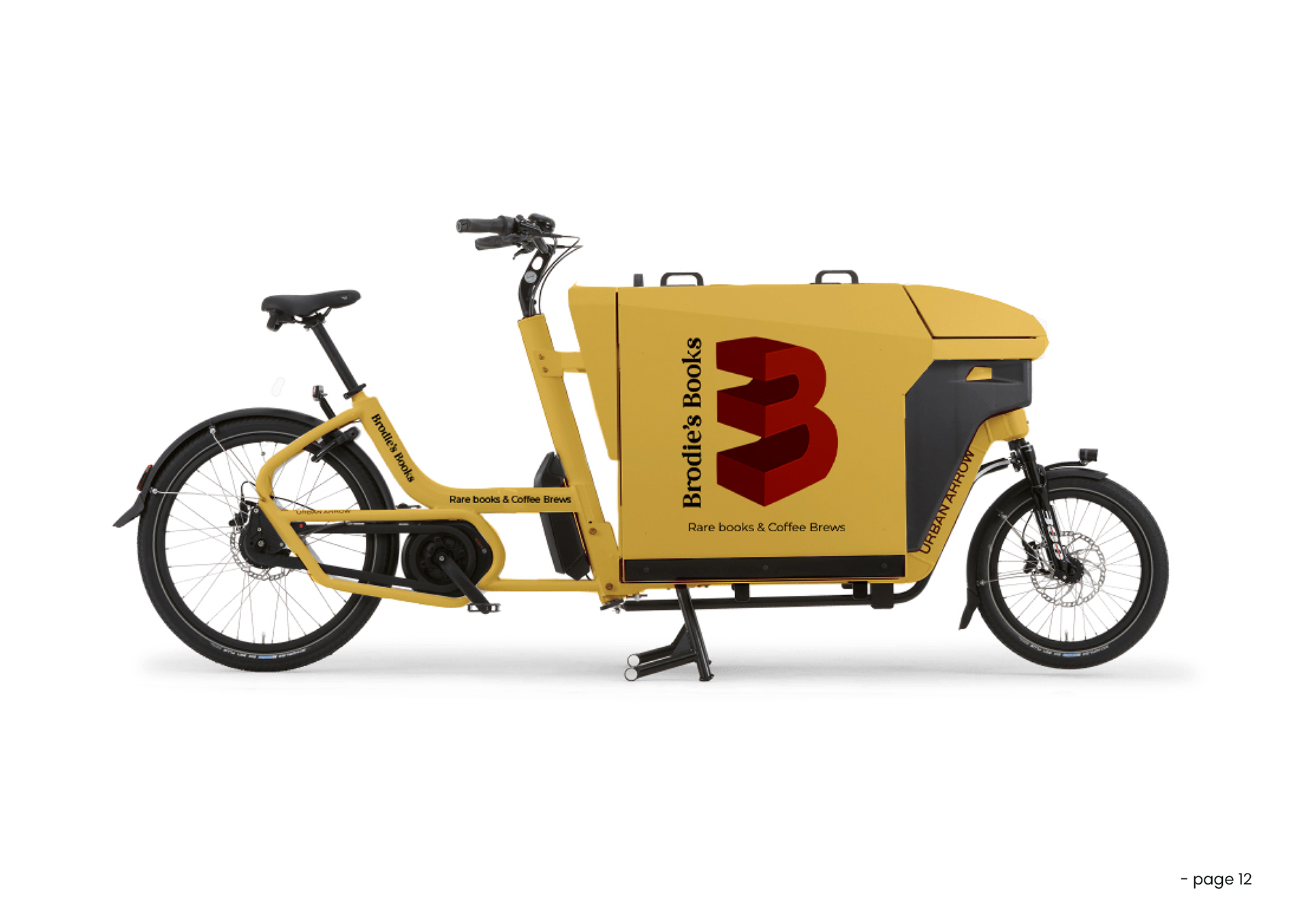
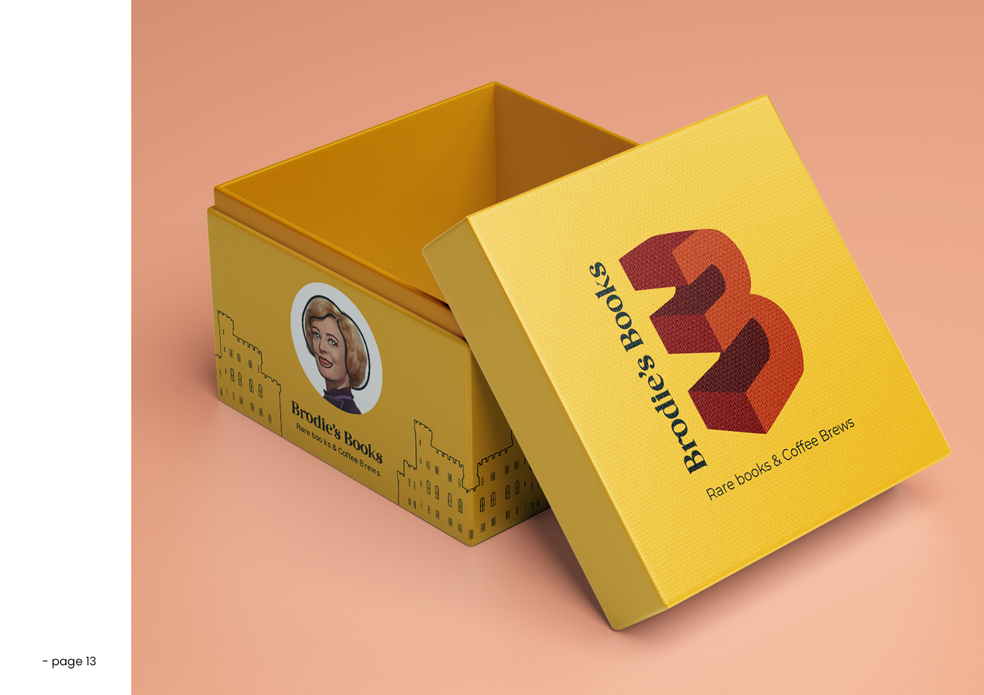
Brodie’s Books wants to rebrand themselves to better reflect the atmosphere of their growing business. Their current logo feels forgettable and lacks uniqueness, which is something they hope to remedy through a more strategic brand system. In addition to the new logo, they want the rebranding to extend to their delivery vehicle and bicycle, which will now match the new branding. They also seek to develop new packaging for their custom coffee, ensuring it stands out from their competitors with a unique design that reflects the essence of the business.
The ultimate goal of this rebranding is to enhance Brodie’s Books as a memorable, tourist-friendly destination in the city center—a haven for book lovers, intellectuals, and coffee aficionados who are seeking a cozy, character-rich space in the heart of the bustling Royal Mile.
Old logo
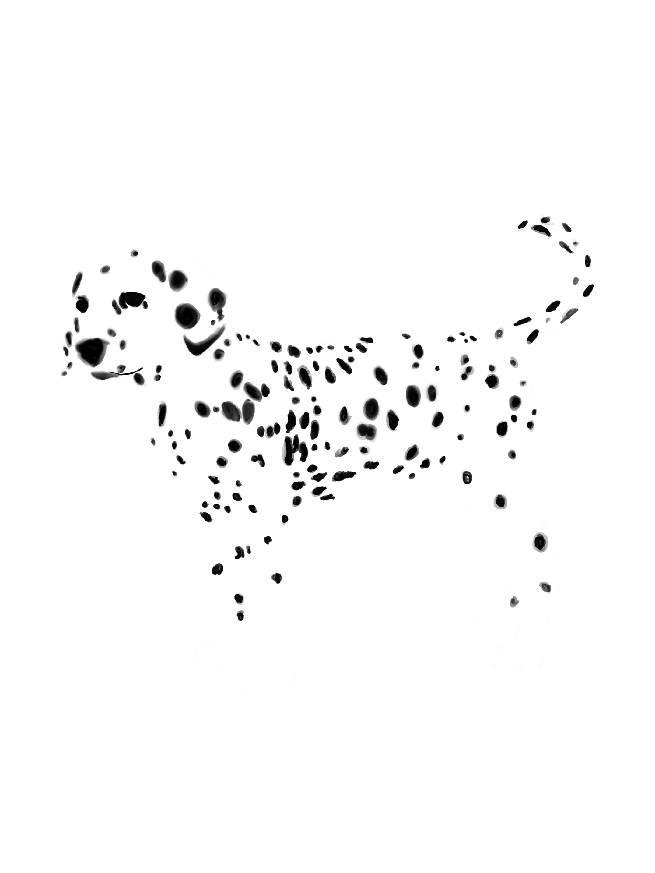
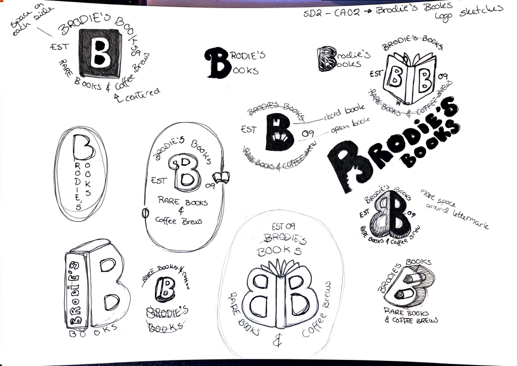
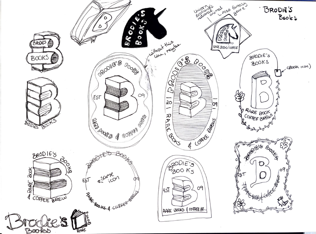
Sketching ideas
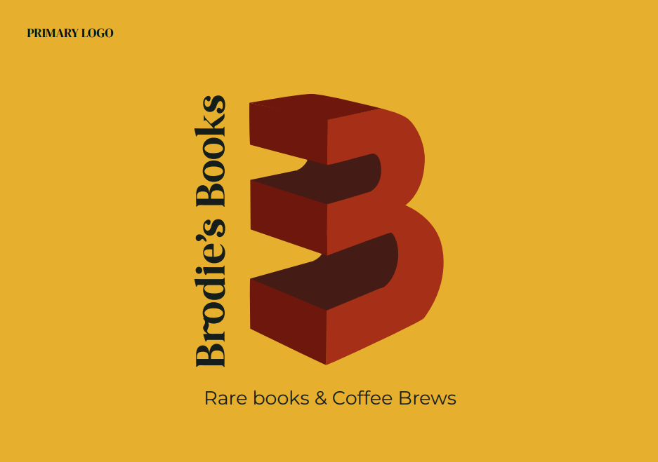
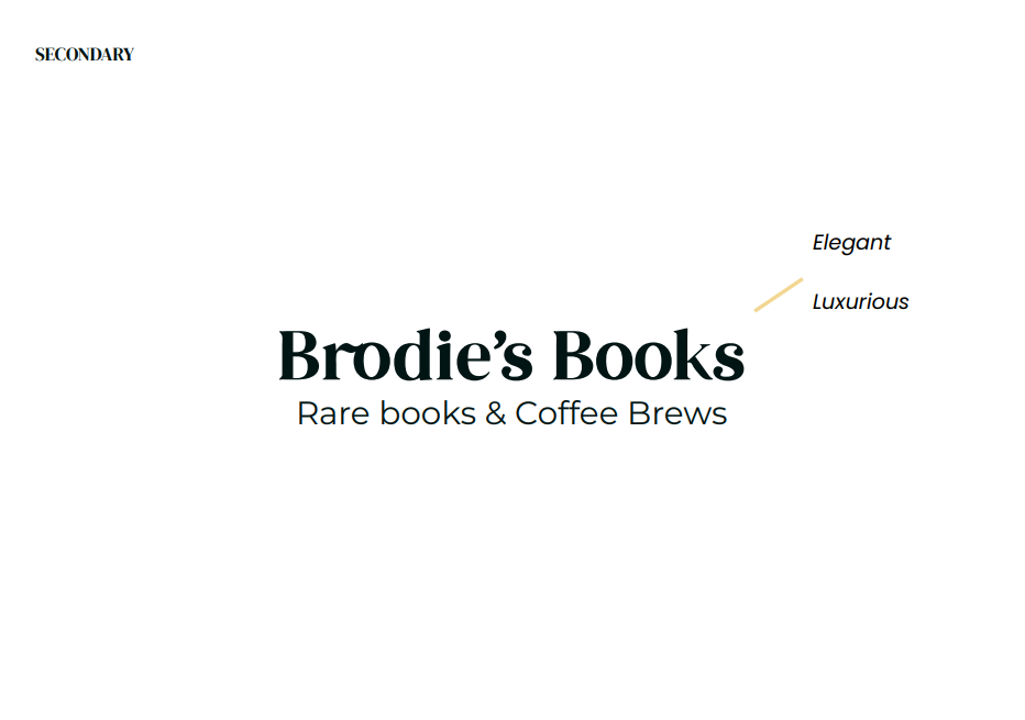
New design
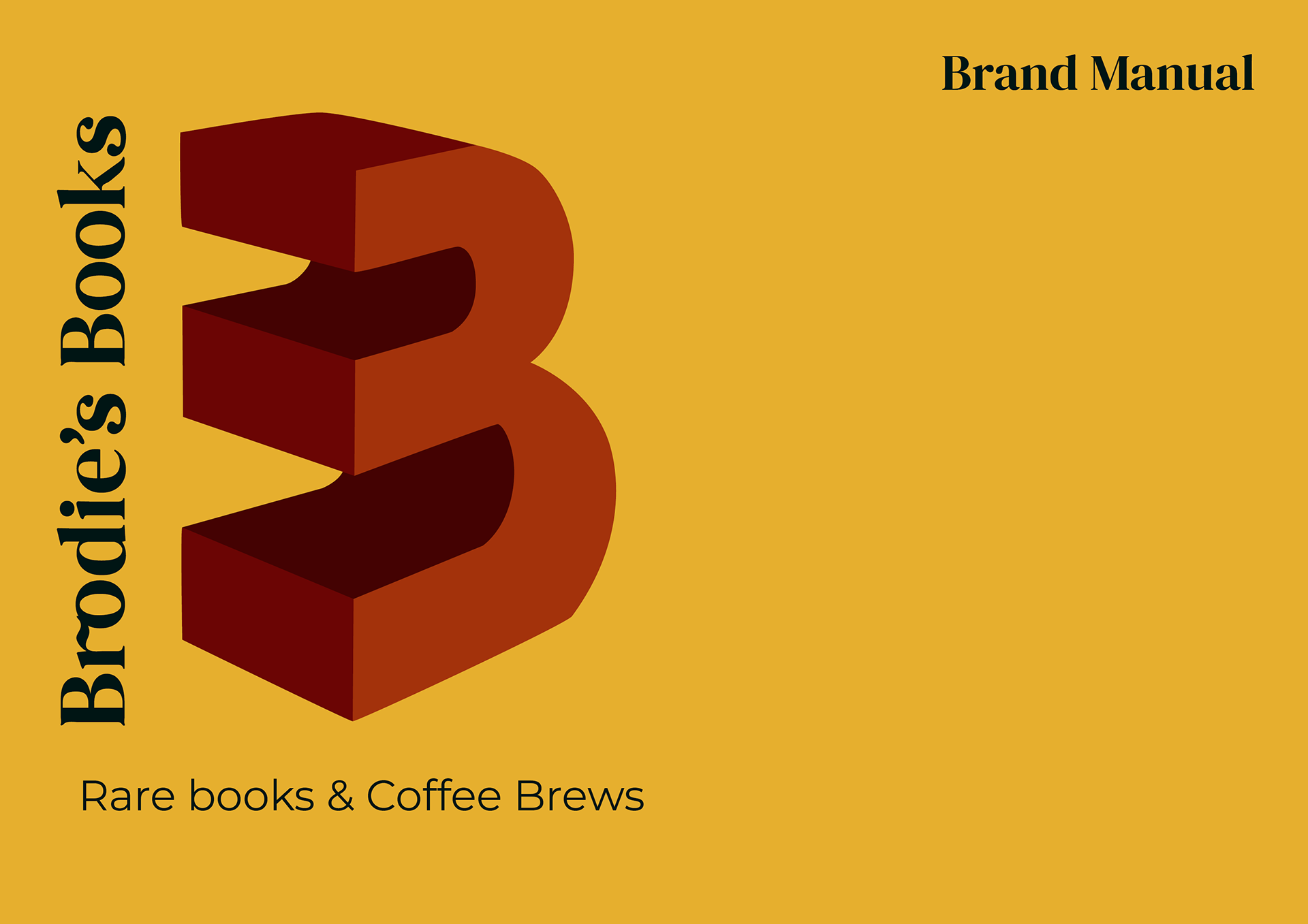
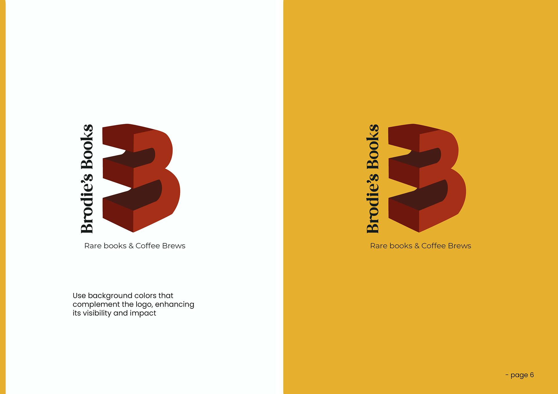
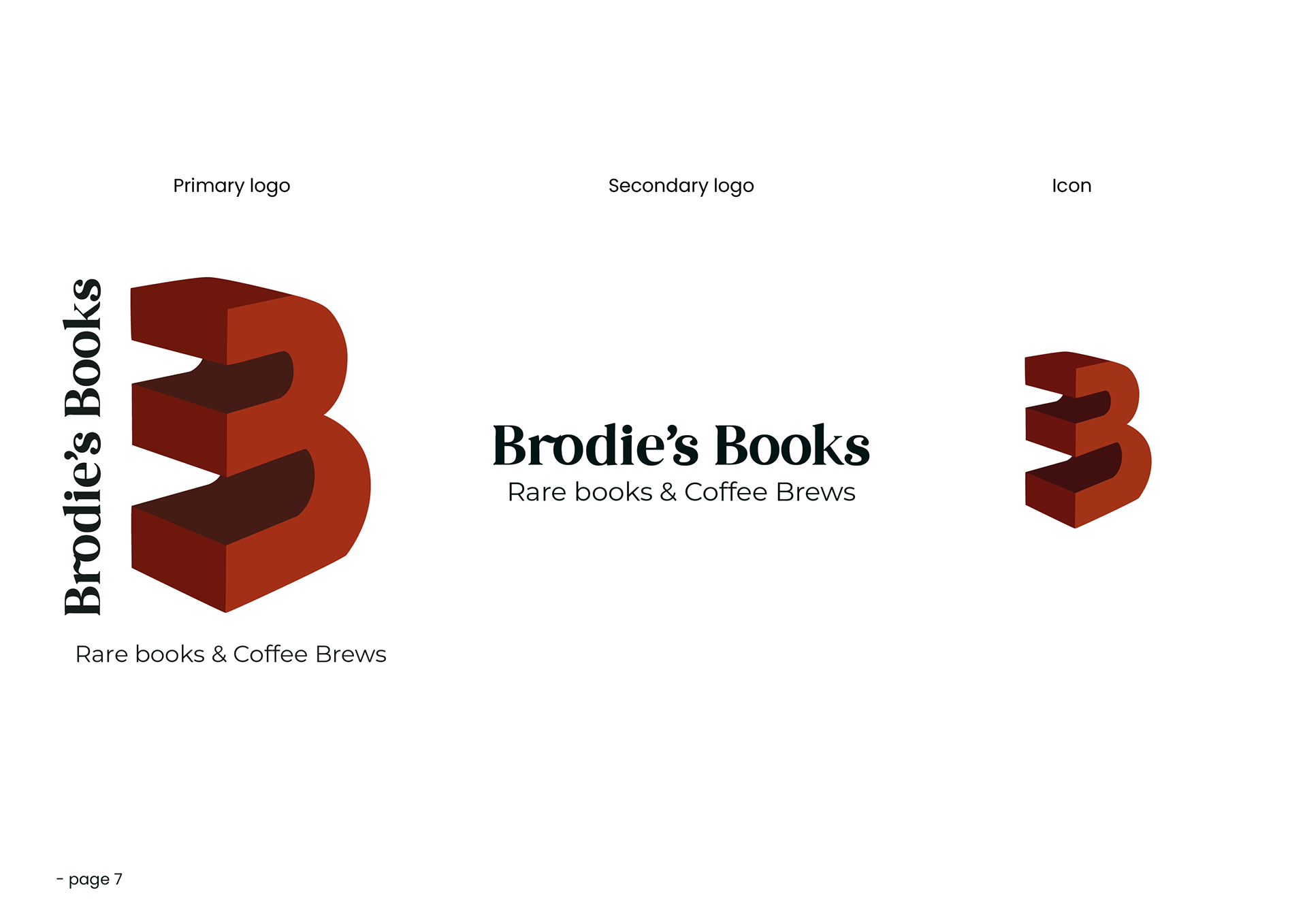
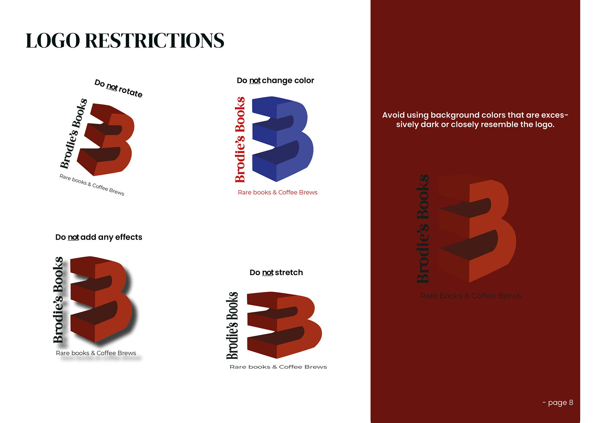
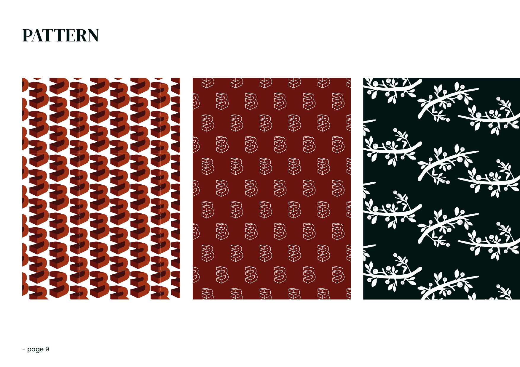
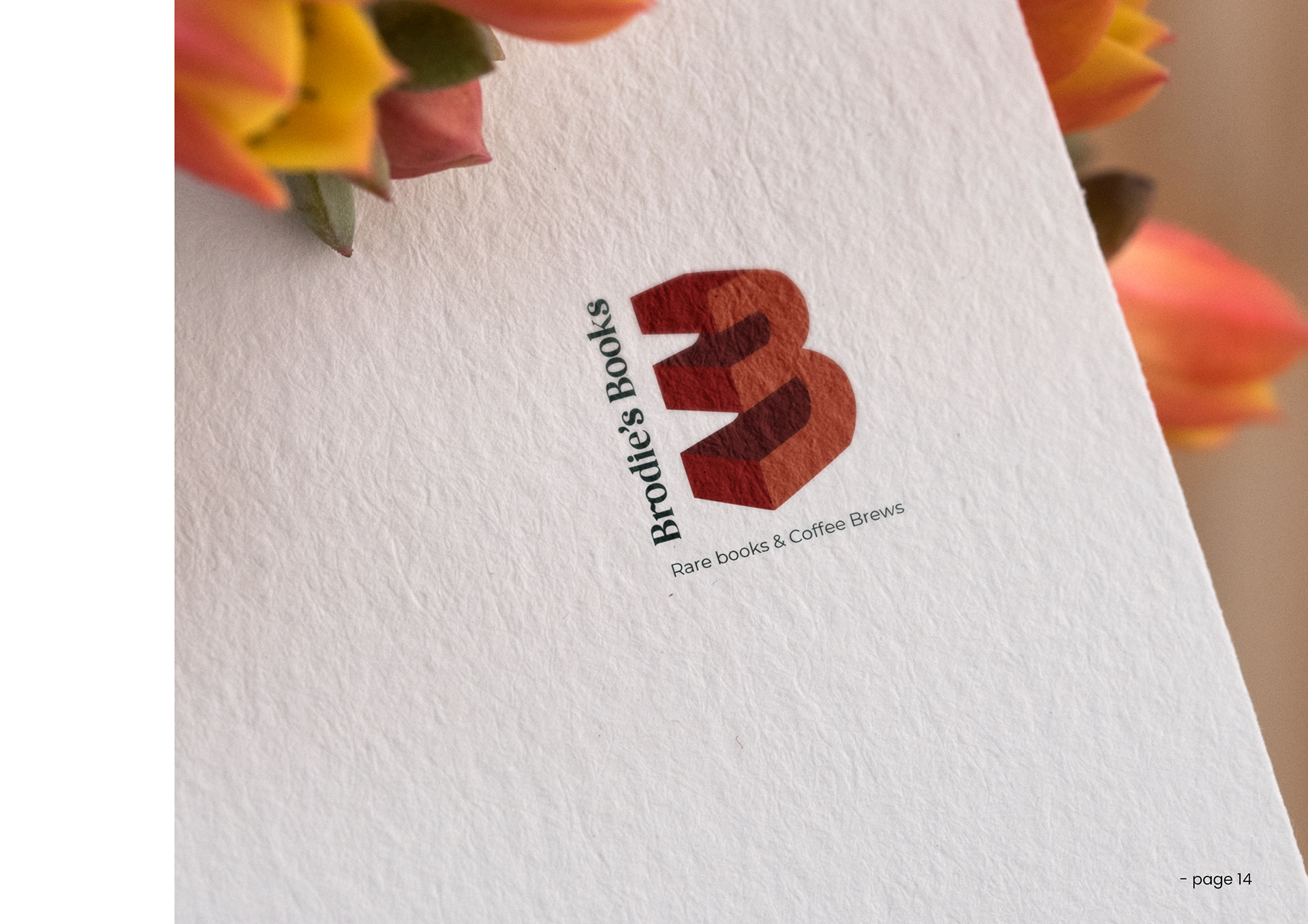
Below, you can see the newly completed design showcased within the Brand Manual I created for the client. The manual not only highlights the fresh visual identity but also provides clear guidelines to ensure consistency across all touchpoints, helping the client maintain a cohesive and professional brand presence.
Mockup attribution: <a href="https://www.freepik.com/free-psd/floral-logo-mock-up_866175.htm">Image by qeaql-studio</a> on Freepik