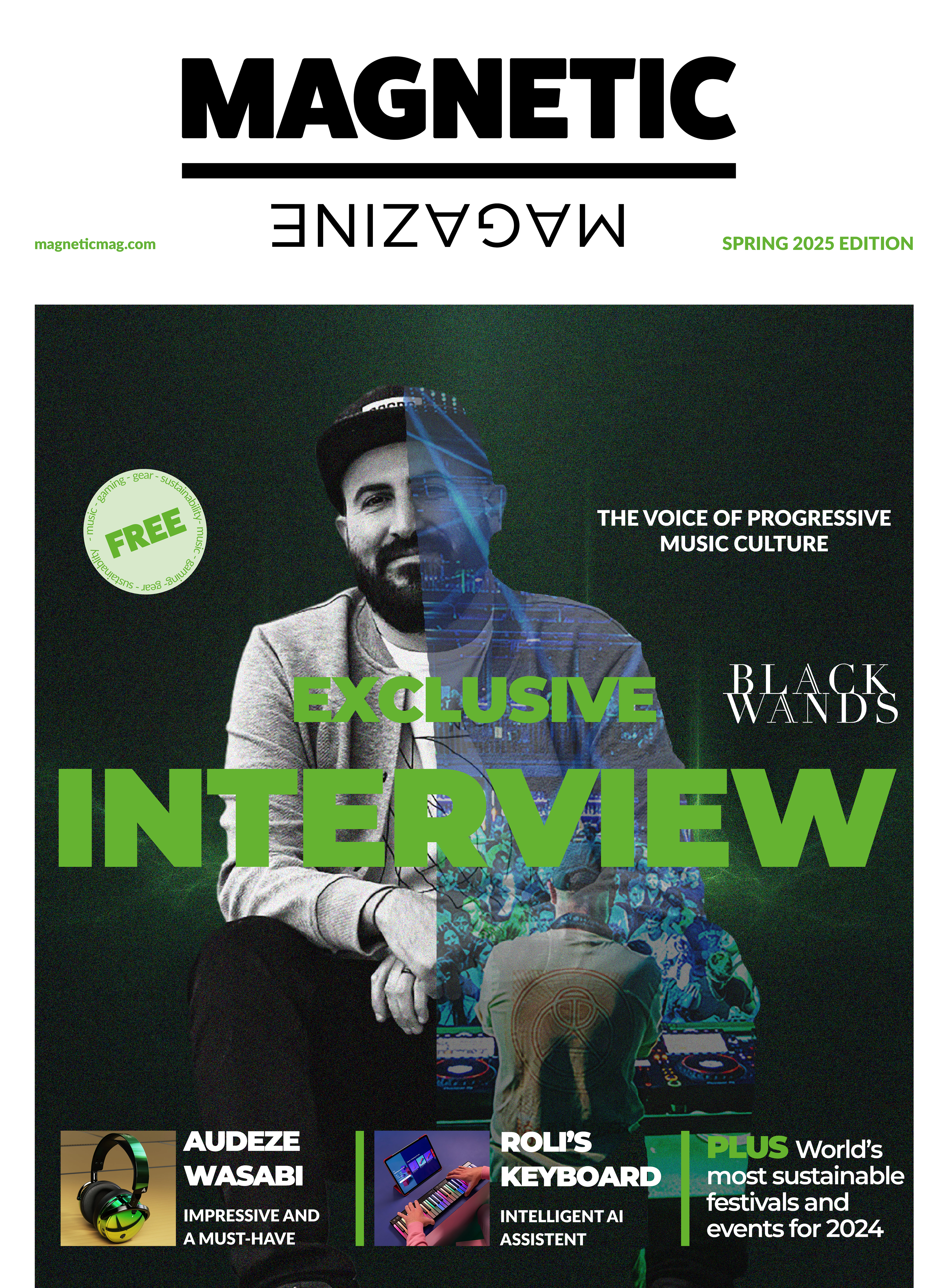
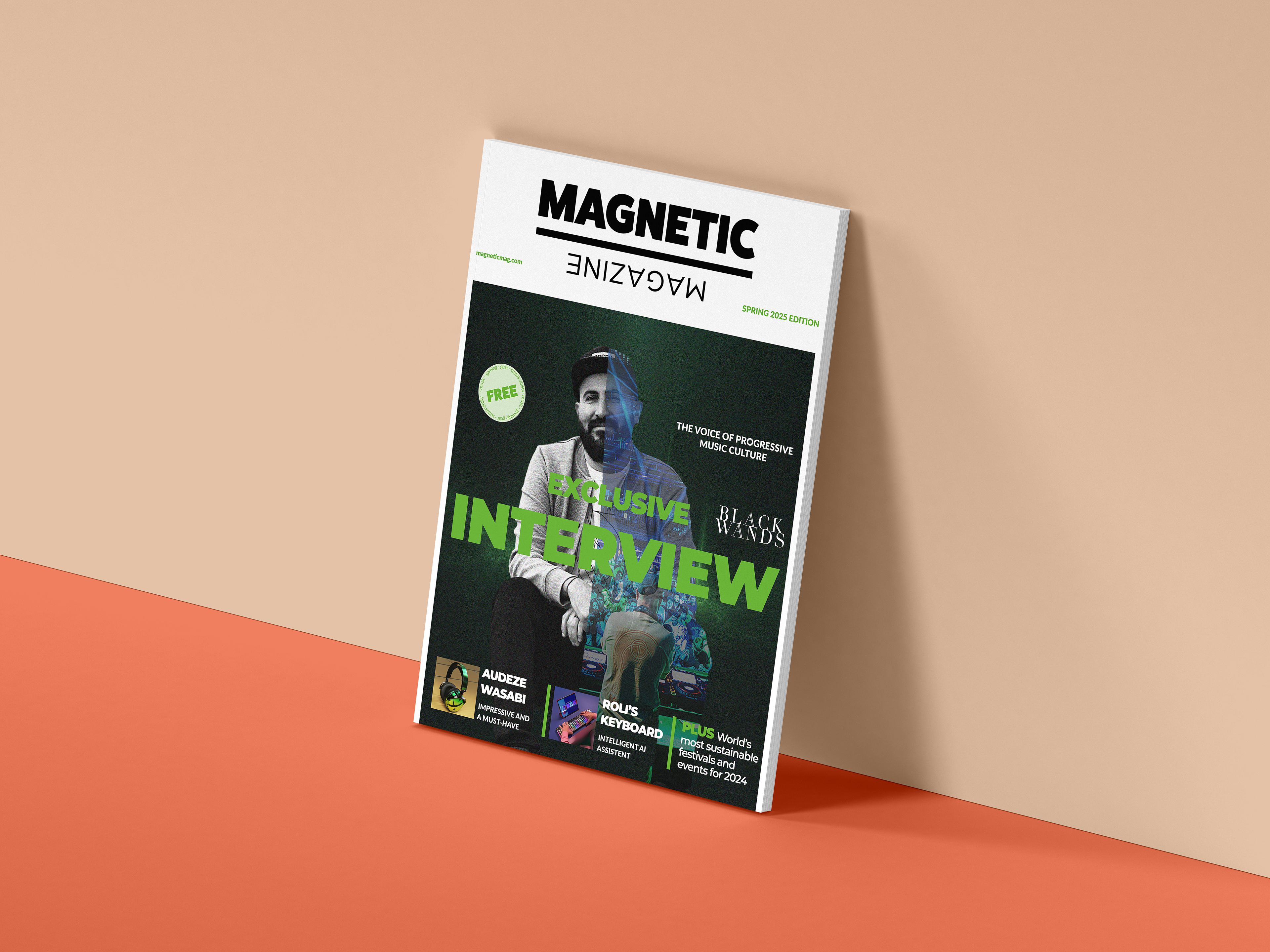
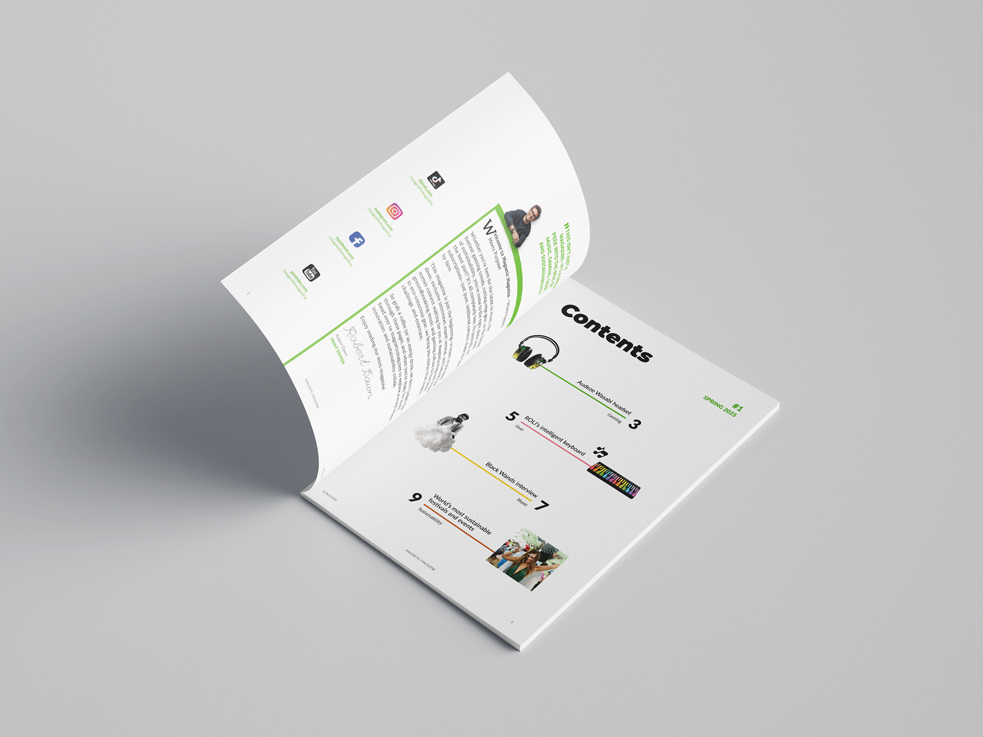
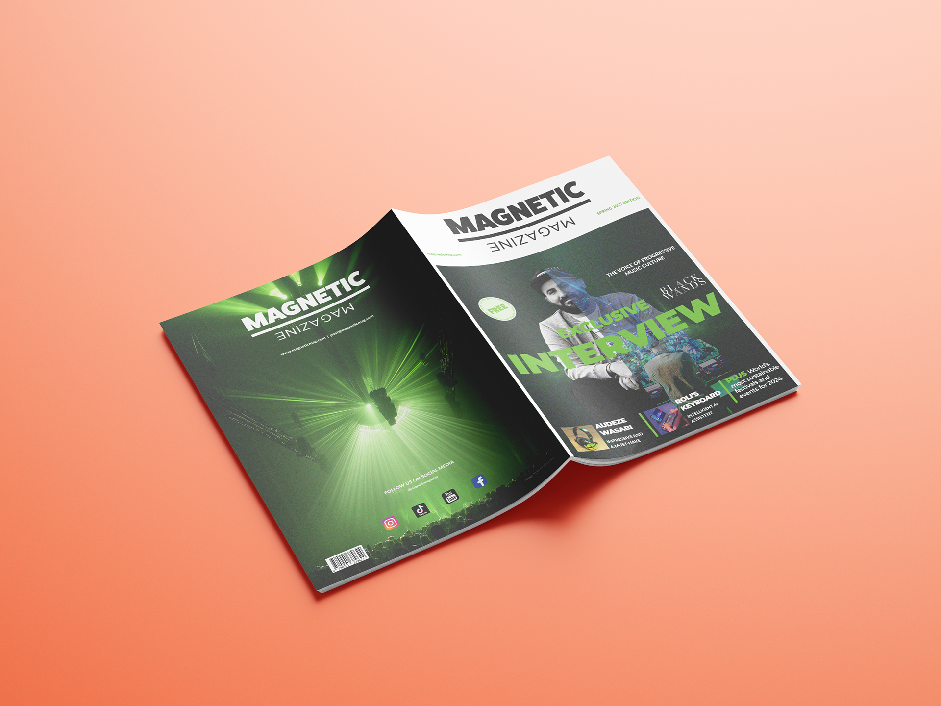
This editorial project involved designing a mini magazine concept presented as a client-ready PDF, exported in spreads. The deliverables included a full cover design, a table of contents spread with an “about us” section, and four complete article layouts based on real content from Magnetic Mag. One of the articles was developed into a feature story with a unique custom-made visual concept, which was also used as the main cover artwork. Throughout the magazine, a consistent grid system and layout style were established to support readability and visual cohesion, while hierarchy, typography, image treatment, and added visual elements beyond the original photography were used to keep the content engaging.
The layout was designed with a clear hierarchy and structure to guide the reader naturally through the content. Since editorial content is often skimmed rather than read in full, strong visual entry points such as imagery, headlines, contrast, and pull quotes were used to catch attention and encourage engagement. Grid systems, columns, and white space were applied consistently to create rhythm and improve overall readability. Typographic choices further reinforced hierarchy, with serif typefaces used for body copy and sans serif typefaces for headings, alongside careful adjustments to leading, tracking, and kerning. Paying attention to details such as avoiding widows, orphans, and excessive hyphenation helped keep the layouts clean and professional.